Creating the Tether Identity
An inside look at how the "Tether brand" came to be.
Designer Hannah Williams and I go over options for the Tether logo. Anything look familiar?
Creating a visual identity that expresses everything Tether encompasses was a collaborative effort. The team at People’s Liberty connected me with designer Hannah Williams, and after weeks of creating and refining (and a good amount of Pinterest-ing), the distinctive "Tether look" was born.
What's in a name?
The name Tether was the result of a vote.
Back in April, local branding agency Cosette worked with me on Launch Day, looking at inspiration and brainstorming words related to photography and production.
After plenty of discussion, we settled on three options: Tether, a photography term that also means “to connect;” Booked, a nod to being booked for a shoot; and Three Degrees, a play on the idea that everyone in Cincinnati is connected by no more than three degrees of separation. I took a few informal surveys, and it turned out no one was really feeling Three Degrees. Womp, womp.
At the First Forum event, everyone voted on the top two options, Booked and Tether. Obviously—and thankfully—Tether won out!
Visual Appeal
Name in hand, the next key to getting the Tether brand right was to create a logo, something clean and simple.
I didn’t want anything too trendy that would date Tether to a certain time or design fad, so Hannah presented three different fonts and three different color palettes before I made the final choice.
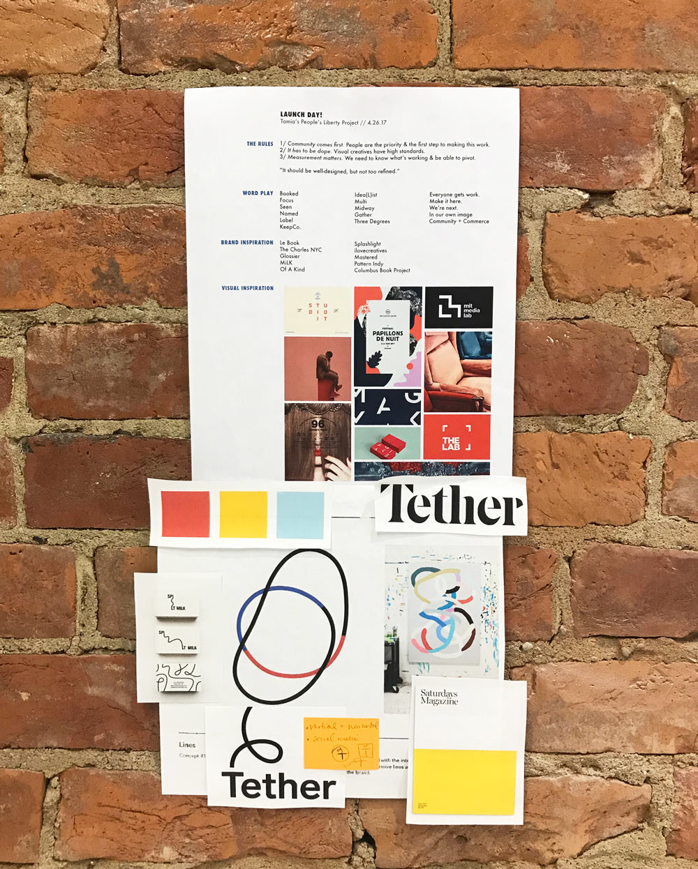
I kept this inspiration collage up at my desk. We were particularly drawn to a combination of color-blocking and organic line shapes.
The sans serif font we chose is Letters From Sweden’s “Lab Grotesque.” I liked its effortless, classic feel—modern, yet timeless. Tether’s brandmark could just as easily be from the late 1970s or from ten years in the future.
Hannah and I played around with the idea of several iterations of logo that could be used in different situations. The Tether rope (more on that in a sec) moves around the wordmark and can bleed off the page in different directions, a symbol of the flexibility of the creatives in Tether’s community.
Color Me Inspired
Reviewing font and color options for the Tether logo
Now it was time to find the right color palette, one that infused the Tether brand identity with the idea of community, modernity, and high-quality work.
Warm red and navy or black kept popping up on my Pinterest inspiration boards for Tether; I’ve always been drawn to high-contrast colors. The empowering boldness of red seemed to fit the project, and it felt like a good counterpoint to the millennial pink pastels we’ve been seeing for the past few years.
Hannah presented several color combinations based on “artsy” primary colors, and I quickly chose the color palette that was a little off-kilter and slightly unexpected. It has a bit of a ‘70s feel, which is not completely surprising given that it’s my favorite decade!
Tying it all together
The curving “rope” that offsets the primary Tether brandmark is composed of three different colors: pale blue, the bold red main color, and a golden yellow.
The three colors are representative of people in different professions as image-makers coming together as a community. And, of course, the rope connects us all!
The main Tether identity. Working on this has been one of my favorite parts of the project!
Whether you’re contributing to the vibrancy of each segment of the rope, or lending a hand in a supportive way, I’m grateful to have you as part of the Tether community. Welcome!
~Tamia Stinson, Founder of Tether


